In a real media text such as a trailer, an 'end card' is always featured on the end of the trailer to announce the release date of the movie, any social media links which may give more insight into the trailer and the title of the film usually. I chose the release date to fall on Halloween due to the scary nature of the film as I thought this would be an appropriate time in the calendar month to realise a film like this. I also added the certified rating of 'PG13' to let the audience know the age you have to be to legally watch this film at a cinema. In addition to this I put the website 'www.killernextdoor' at the bottom of the page, this gives the audience more information about the film incase they are interested to read further into the plot before they chose seem the film. I also added the hashtag of 'killernextdoor'. I did this because social media is a great way of gaining more attention to your product and people are more likely to find out about the film through the sharing of the hashtag on audience members social media platforms such as twitter and face book.
I made the bottom small print on photoshop which included the names of actors, directors, producers and the rightful film companies which where associated with in the making of the film.
At the beginning of the trailer I added a disclaimer stating that this following trailer had been approved for viewing by a higher authority. This allowed me to relate my film in the first place. This is a very common feature of a real media text.
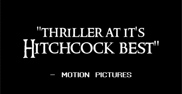
The next set of text cards were featured in the trailer. I made these captions on photoshop and quoted what film review critics had said about the film. This is a common in a real media text trailer as it emphasises how good the film is and makes people want to watch it when they see good reviews from professional critics.
Next I created the font which I wanted to be the face of 'killer next door' and would be featured on other products as well to crate brand synergy between them all. SO as to make it obvious to the audience that they are all advertising the same thing. I used a website online rather than using photoshop because there were very limited options in terms of font on the photoshop software which didn't fit my trailer or correlate to my genre. I used the website '1001fonts.com' to create the font which I thought conveyed the correct tone of the film and matched the aesthetic of the product. The font I chose was 'ringbearer' font.
Now, I had the font which I wanted but I wasn't completely happy with the way it turned out. I wanted to added texture and a 3D quality to the text as it was very flat and didn't stand out very much. Therefore I imported it onto a black screen on photoshop and played around with 'layering styles' in order to enhance the look of the text until it met the requirement to fit my genre perfectly.
This was the finished end card for the title of the film and I felt that it was a drastic improvement from the first version of the text as it fitted into the aesthetic of the trailer more and reflected the tone and genre of the film.


No comments:
Post a Comment